

What Is Flexbox
Flexboxis a part of CSS that provides an efficient way to lay out, align and distribute space among items in a container. Before flexbox became popular, it was a real challenge to center elements. We would use something calledfloatwhich would behave unpredictably at a times.
The Two Axes of Flexbox
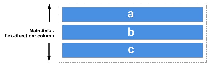
Everything we do in the flexbox revolves around the two axes, the main axis and the cross axis. The main axis is defined by the
flex-directionproperty and the cross-axis runperpendicularto it.So let us know more about the two axes.
The Main Axis
The main axis is defined by flex-direction, which has
fourpossible values:
row
row-reverse
column
column-reverseYou Should choose row or row-reverse, your main axis will run along the row in the
inlinedirection

You Should choose column or column-reverse, your main axis will run along from the top of the page to the bottom of the page in
blockdirection.
The Cross Axis
The cross axis runs perpendicular to the main axis, therefore if your
flex-direction(main axis) is set toroworrow-reversethe cross-axis runs down the columns.
If your main axis is
columnorcolumn-reversethen the cross-axis runs along the rows.


How To Use Flebox
To use the flexbox model firstly, we need to define the flexbox container.
HTML Code:
    <div class="container">
      <div class="box">
        1
      </div>
       <div class="box">
         2
      </div>
       <div class="box">
         3
      </div>
    </div>
And then we have to add CSS to the flexbox container to make it a flexbox model.
CSS code:
.container{
    display: flex;
    border: 2px solid #000;
}

.box{
  text-align: center;
  border: 2px solid cyan;
  height: 200px;
  width: 200px;
  margin: 20px;
}
You can just have a look at this demo for a better understanding.
Flex-Direction Property
As we have seen earlier that we can set the flex property in two directions (Main and Cross axis) i.e
rowandcolumn.So flex-direction property allows us to set the direction and orientation in which our flex-items should be distributed inside the flex-container.
As you can see we have
four attributesthrough which we can deal with flexbox containers.So let's just see examples for each of them and understand them in a better manner.
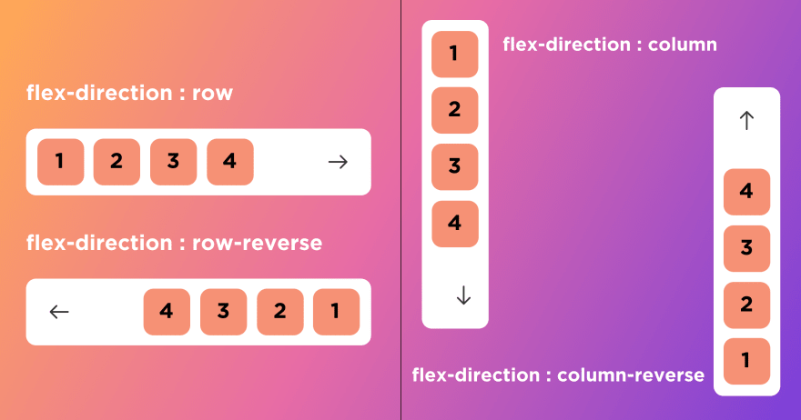
Flex-Direction: row
Row:
Rowrepresents the horizontal axis oriented from the left to the right.CSS code:
container {
  display: flex;
  flex-direction: row;
}
Example:
Row-reverse:
row-reverserepresents the horizontal axis oriented from the right to the left.CSS code:
.container {
  display: flex;
  flex-direction: row-reverse;
}
Example:
Flex-Direction: Column
Column:
The
flexboxitems are ordered the same way as the text direction, along the cross-axis flex-direction.CSS Code:
.container {
  display: flex;
  flex-direction: column;
}
Example:
Column-reverse:
In the
Column Reverseflexbox items are ordered the opposite way as the text direction, along thecross axis.CSS Code:
.container {
  display: flex;
  flex-direction: column-reverse;
}
Example:
Justify-Content Property
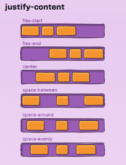
This property
justify-contentallows us to arrange the flex-items along the main axisinside the flex-box container.
Flex-Start:
The
itemsare packed toward thestartline.CSS Code:
.container {
  display: flex;
  justify-content: flex-start;
}
Example:
Flex-End:
The
itemsare packed toward to end line.CSS Code:
.container {
  display: flex;
  justify-content: flex-end;
}
Example:
Center:
To
centerthe inner div element we will make the parent aflexcontainer.CSS Code:
.container {
  display: flex;
  justify-content: center;
}
Example:
Space-Between:
space-betweenevenly distributes space items between thefirst itemis set at the start of the container, and thelast itemis set at the end.CSS Code:
.container {
  display: flex;
  justify-content: space-between;
}
Example:
Space-Around:
space-aroundplaces items with spacedistributed evenlyaround thestart and endof the list.CSS-Code:
.container {
  display: flex;
  justify-content: space-around;
}
Example:
Space-Evenly:
space-evenlyis a value that can be assigned to the justify-content property to distribute flex items in such a way that the items have equal space around them.CSS Code:
.container {
  display: flex;
  justify-content: space-evenly;
}
Example:
Flex-Wrap Property
The
flex-wrapCSS property sets whether flex items are forced onto one line or can wrap onto multiple lines. If wrapping is allowed, itsets the directionthat lines are stacked.Wrap :
The
wrapCSS property sets whether flex items are forced onto one line or can wrap onto multiple lines.CSS Code:
.container {
  display: flex;
  flex-wrap: wrap;
}
Example:
No-Wrap:
The
No-wrapCSS property sets whether flex items are forced onto one line.This is a default property of the flexbox container.
CSS Code:
.container {
  display: flex;
  flex-wrap: nowrap;
}
Example:
Wrap-Reverse:
The
wrapCSS property sets whether flex items are forced onto one line or can wrap onto multiple lines.CSS Code:
.container {
  display: flex;
  flex-wrap: wrap-reverse;
}
Example:
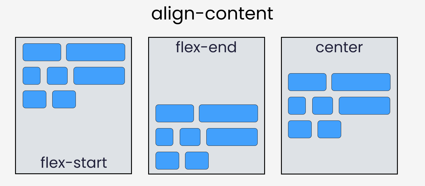
Align-Content Property
The
align-itemIn Flexbox, it controls the alignment of items on theCross Axis. Grid Layout controls the alignment of itemsBlock Axiswithin their grid area.
Flex-Start:
The
itemsare packed flush to each other against the edge of the alignment container depending on theflex container's cross-startside. This only applies to flex layout items. For items that are not children of aflex container, this value is treated as a start***.***CSS Code:
.container {
  display: flex;
  align-content: flex-start;
// without this line, align-content won't work
    flex-wrap: wrap;
}
Example:
Flex-End:
The items are packed flush with each other against the edge of the alignment container depending on the
flex container's cross-endside. This only applies to flex layout items. For items that are not children of a flex container, this value is treated as an end.CSS Code:
.container {
  display: flex;
  align-content: flex-end;
// without this line, align-content won't work
    flex-wrap: wrap;
}
Example:
Center:
The items are packed flush with each other in the center of the alignment
containeralong thecross axis.CSS Code:
.container {
  display: flex;
  align-content: center;
// without this line, align-content won't work
    flex-wrap: wrap;
}
Example:
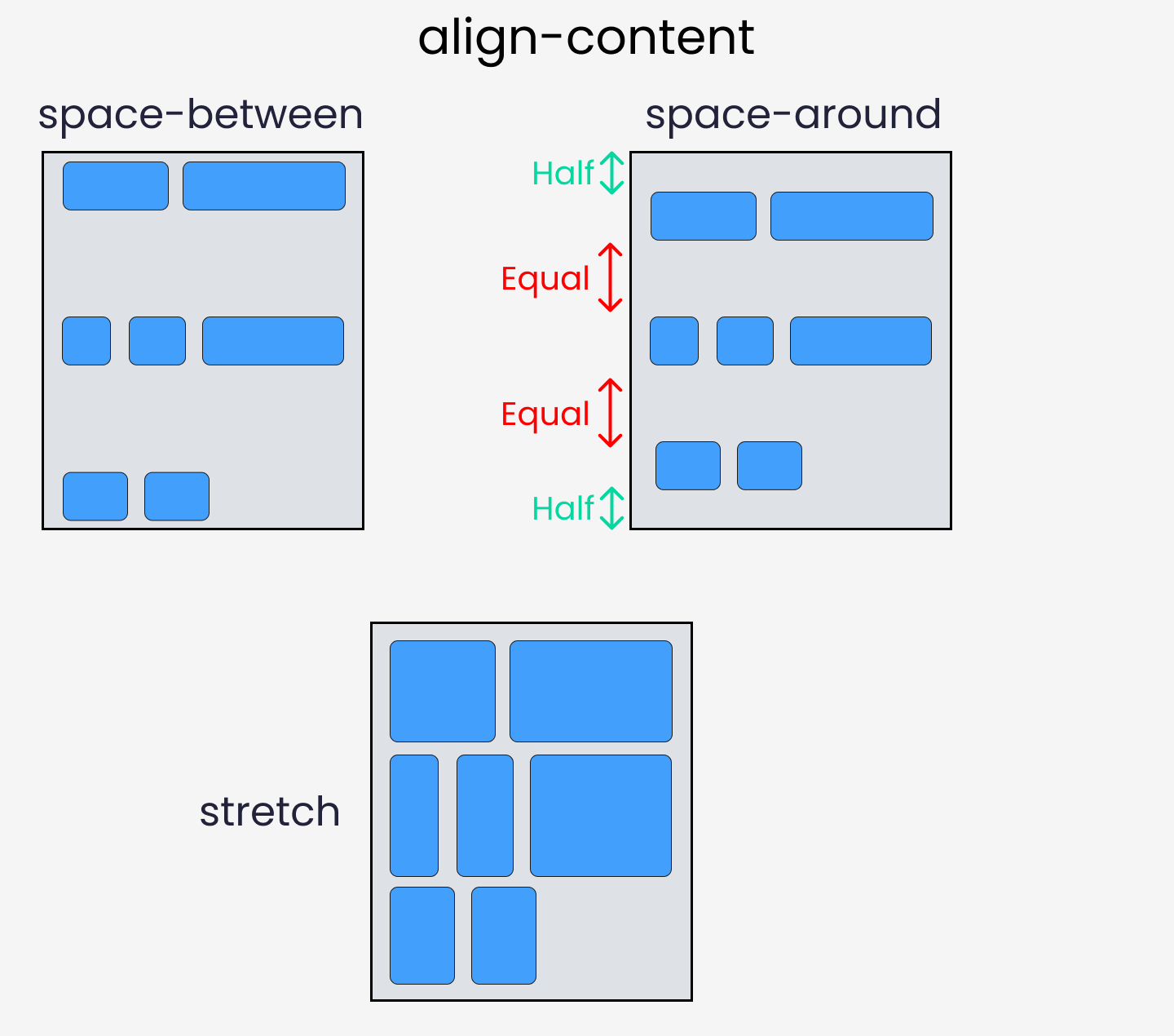
We have 3 more attributes that we can use with the align-content property:
space-between
space-around
stretch
We just have to change one line of CSS in the code.
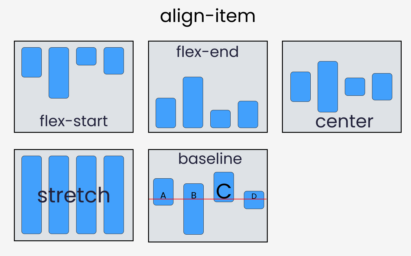
Align-Items Property
The
align-itemIn Flexbox, it controls the alignment of items on theCross Axis. Grid Layout controls the alignment of itemsBlock Axiswithin their grid area.
Flex-Start:
The flexbox items are aligned at the start of the
cross-axis.CSS Code:
.container {
  display: flex;
  align-items: flex-start;
}
Example:
Flex-End:
The flexbox items are aligned at the end of the
cross-axis.CSS Code:
.container {
  display: flex;
  align-items: flex-end;
}
Example:
Center:
The flexbox items are aligned at the center of the
cross-axis.CSS Code:
.container {
  display: flex;
  align-items: center;
}
Example:
Stretch:
The flexbox items will stretch across the whole
cross-axis.CSS Code:
.container {
  display: flex;
  align-items: stretch;
}
Example:
Baseline:
The flexbox items are aligned at the baseline of the
cross-axis.CSS Code:
.container {
  display: flex;
  align-items: baseline;
}
Example:
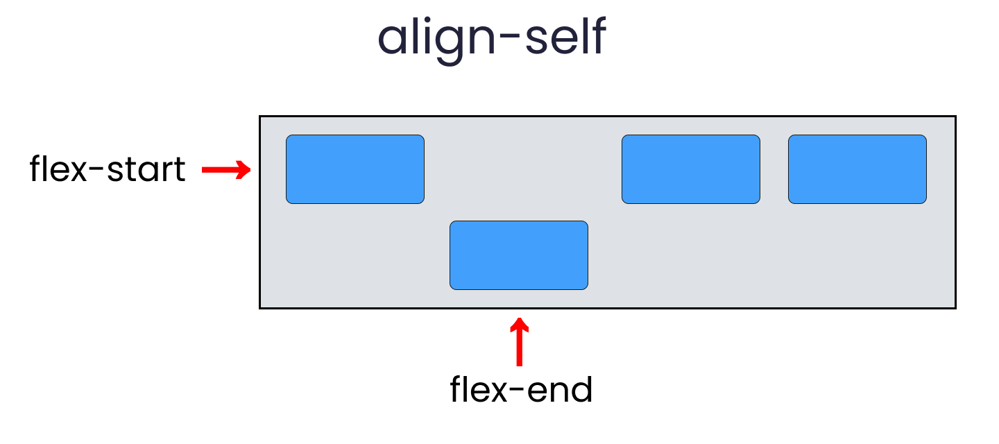
Align-Self Property
This property works on the child classes. It positions the selected item along the
cross-axis.
In total it has 6 values:
flex-start
flex-end
center
baseline
stretch
auto
To create the results, select any
.box-*and write the following code:Use the Below Example for Demo (using flex-end , similarly you can use different attributes):
flex - grow | shrink | basis properties
The properties will work when we resize the window. Let's dive right in.
flex-grow
This property grows the size of a flex item based on the
widthof the flex container.Example:
flex-shrink
This property helps a flex item shrink based on the width of the flex container. It's the opposite of
flex-grow.Example:
flex-basis
This is similar to adding width to a flex item but only more flexible. flex-basis: 10em, for example, will set the initial size of a flex-item to 10em. Its final size will be based on the available space, flex-grow, and flex-shrink.
Example:
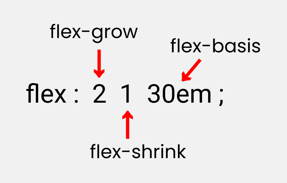
Shorthand Flexbox Property
flex shorthand
This is the shorthand for the flex-grow, flex-shrink and flex-basis properties combined.
Let's just see the last property of flexbox with example:
Example:
Takeaway
If you have come to this point reading the article then I am sure you will be confident while using flexbox in your projects ahead.
Here's your medal for reading till the end ❤️
That's it for the day see you in the next blog until then...
Keep Writing Code❤️