CSS Grid
A Guide To CSS Grid

Prerequisites
Hello Everyone Welcome to my new article on CSS grid, so before getting started, I assume that you guys are very familiar with the basics of HTML & CSS.
What is CSS Grid
So What Is CSS Grid:
CSS grid is used for creating
two-dimensionallayouts. It is different from CSSflexbox, which can only createone-dimensionallayouts and is mainly created for alignments. Being a two-dimensional layout system means that a CSS grid allows us to simultaneously work with columns and rows to build complex and responsive layouts. The advent of CSS grid means we no longer need to deploy hacks likepositioningandfloats.
Why CSS Grid
Have you ever had a problem positioning elements on the web page?
I think so each of everyone has experienced this sort of problem in a web development journey, Perhaps every time you think of a solution you become tired and give up.
If so, stay tuned as I reveal a new method for resolving these kinds of problems with minimal or no stress.
CSS grid is not the only approach you might take, but it’s one with several important benefits:-
Flexible Track Sizes
You can use the
frunit (Fraction Unit) to assign any specified pixel value to the grid. This will make your grid organized and responsive.Item Placement
CSS grid has made it much easier to position items in the container in any area you want them to be without having to mess with the HTML markup.
Alignment Controls
The alignment of an element/item in a container is easier than ever before with CSS Grid. In the container, you can now arrange elements/items horizontally and vertically as you wish.
When Should Someone Use CSS Grid
Although you can use CSS Grid in practically any aspect of web development, there are certain situations when it's ideal.
For example, when we have a complex design layout to implement, CSS Grid is better than the CSS float property. This is because Grid is a two-dimensional layout (with columns and rows), whereas the CSS float property is a one-dimensional layout (with columns or rows).
Grid is also a good choice when we need space or a gap between elements. By using the CSS grid
gapproperty, the spacing of two elements is much easier than using the CSSmarginandpaddingproperties which might end up complicating things.
CSS Grid Principles
By the time we all know that CSS Grid is a two-dimensional layout system for the web. With a CSS grid, you can lay content out in rows and columns.
Before we go deeper, let’s take a look at the building block of the CSS grid, the
display: grid;container.First let's see the basic example of a CSS Grid:
<body class="container">
    <div class="item box-1"><p>One</p></div>
    <div class="item box-2"><p>Two</p></div>
    <div class="item box-3"><p>Three</p></div>
</body>
Next, we will define the grid layout by setting the
displayproperty togrid// Setting the display property of container to grid .container{ display: grid; }
Terminology Of CSS Grid
Once your
gridis defined, you’re in a good position to start. However, that doesn’t do anything magical just yet. We need to tell thegridhow big the columns and rows should be. let’s discuss the terminology of CSS grid:
Grid container: The parent container where you’ve defined your
grid displayGrid items: The direct children of your
gridcontainerGap: Used to create gutters, the spaces between
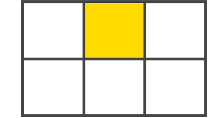
gridcells, through rows and columnsGrid cell: The space between two adjacent rows and two adjacent column
gridlines. It’s a single unit of thegrid. Here’s a picture to explain a grid cell:
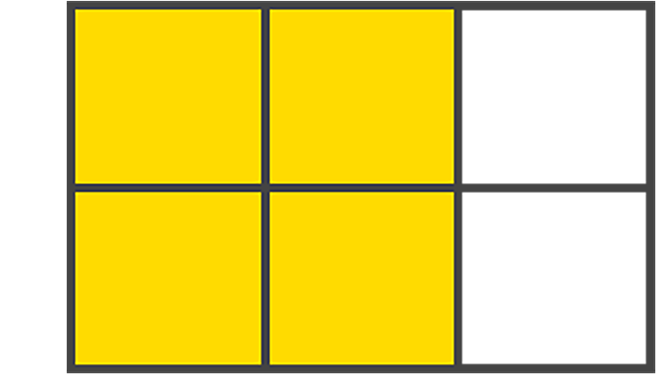
- Grid area: One or more grid cells make up a rectangular area on the grid. Grid areas must be rectangular in nature. Here’s an example:
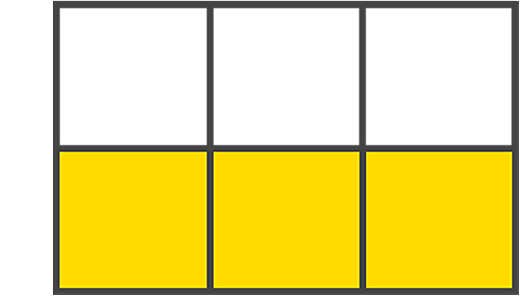
- Grid track: Tracks are the space between two adjacent grid lines — essentially, the lines that start and stop rows or columns, so you’ll always have one more than the number of columns and rows you already have.here is an image:
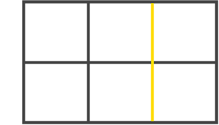
- Grid lines: These are the dividing lines that are created when you define a grid display:
Implicit And Explicit Grid Lines
Implicit grid lines are visualized as dotted lines in your dev tools and are created by the browser without explicitly defining columns or rows.
Let’s use this code snippet to explain implicit grid lines:
.container{
    display: grid;
    grid-template-columns: 200px 200px 200px;
}
Explicit grid lines are the solid lines visible in the dev tools for rows and columns defined within your CSS. Explicit scenarios aren’t decisions made by the browser; they’re the decisions you make, which are explicit.
Here’s an example:
Gutters In CSS Grid
Gutters are the spaces between grid cells. You can create a gutter using the
gapshorthand property, or you can do so explicitly usingcolumn-gapandrow-gap. Should you use thegapshorthand property to create the gutter, the value you assign to thegapwill target both therowandcolumnof the grid.To provide your grid with gutters, using
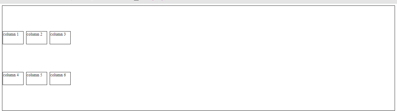
gap, you’ll define this property in the parentcontainer:// using gap to create gutter of 40px row and column .container { gap: 40px; /* row and column gap */ } // this can also be written as .container { column-gap: 40px; row-gap: 40px; }Here is an Example:
Fractional Units in CSS Grid
The
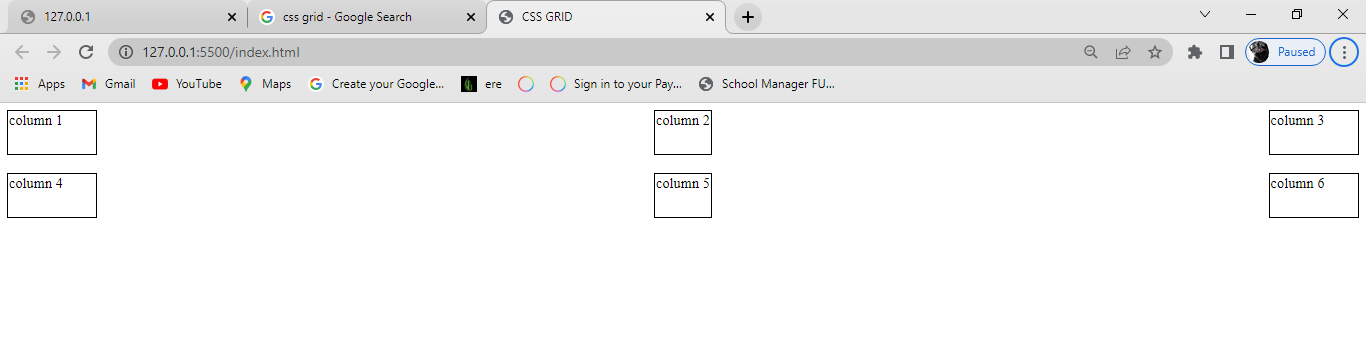
frvalue, otherwise known as the fractional unit, solves the problem of automatically distributing free space among elements and replaces the need for percentages and pixels.Let’s update our example’s CSS file to switch from pixels to
fr:.container { display: grid; gap: 40px; grid-template-columns: 1fr 1fr 1fr; }Note how the sizes of the child elements in the grid automatically increase in width to fill the available space in the grid parent:
Here is an Example:
Grid Containers, columns and rows
Seeing as nothing really happens until you actually define rows and columns, we should now learn to create them. There are various ways to define each, so let’s begin by learning how to create columns.
Columns and column spanning
The
grid-template-columnsproperty is created in thecontainer(parent)where each value passed represents the number of explicit columns. For example:.container { grid-template-columns: 40px 1fr 20px; }The example above tells the browser to create three columns. The first column is
40pxwide, the second column is1fr, and the third column is20px.The technique known as spanning allows child items to stretch across columns present in your
gridby definingcolumn startandcolumn endpositions, as shown below:.container{ display: grid; grid-template-columns: 1fr 1fr 1fr 1fr 1fr; } .child-item:nth-child(1) { grid-column: span 3; /* span 3 columns */ } .child-item:nth-child(2) { grid-column: span 3; }Here is an example:
Rows and Spanning Rows
Grid rows are just like columns, only they run horizontally instead of vertically. The property is written identically to our column counterpart, except we use the word
rowsinstead. Here’s how that’s written in CSS:.container { grid-template-rows: 1fr 1fr 1fr 1fr 1fr; }The above example defines four explicit
rows, each of which is1frhigh. If any children wrap to a newrow, that’s when your implicitrowswill be created.With the
grid-rowshorthand property, we have the same opportunity to span rows just like we can span columns, like so:.item:nth-child(1){ grid-row: span 1; } .item:nth-child(2){ grid-row: span 3; }Here is an Example:
Shorthand Property To Create rows and columns
The
grid-template()shorthand property lets you define a start and end position for rows and columns in one line and is comparatively far more accessible to read than thegridthe property we previously discussed.The shorthands we'll be seeing are
grid-template-rowsandgrid-template-columns, but we also havegrid-template-areas..container { grid-template: 1fr 1fr / 200px 200px 200px; }The first value is the start position, and the second value is the end position, followed by the slash
/that repeats this pattern. You can think of it like this: the part in front of the/is your rows, and the part behind the/are your columns.Here is an Example:
Justify-Content Property
This is a grid property that you use in positioning items (columns and rows) horizontally in a container. It displays how the web browser positions the spaces around the items.
It has in total 6 six property values:
Start
end
center
space-around
space-between
space-evenlyStart
This positions the items at the left side of the browser and can be executed with the following code:
justify-content: start;
End
This positions the items on the right side of the browser and can be executed with the following code:
justify-content: end;
Center
This positions the items at the center of the browser and can be executed with the following code:
justify-content: center;
Space-around
This property distributes the items in the container evenly, where each item in the container has an equal amount of space from the next container.
This code can be executed like this:
justify-content: space-around;
Space-between
Just like the
space-aroundproperty,Space-betweendistributes the items in the container evenly, where each item in the container has an equal amount of space from the next one in the container and takes up the entire width of the container in the vertical direction.This code can be executed like this:
align-content: space-between;
Space-evenly
Just as the name states, this property distributes the items in the container evenly, where each item in the container has an equal amount of space from the next one vertically.
This code can be executed like this:
align-content: space-evenly;


Align-Content Property
Align content is the opposite of
justify-content. You use thealign-contentproperty in positioning items vertically in a container.Just like
justify-content, thealign-contentproperty has six possible values:
Start
end
center
space-around
space-between
space-evenlyStart
This positions the items at the top of the browser and can be executed with the following code:
align-content: start;
End
This positions the items at the bottom of the browser and can be executed with the following code:
align-content: end;
Center
This positions the items at the center of the browser and can be executed with the following code:
align-content: center;
Space-around
This property distributes the items along the side of the container evenly, where each item in the container has an equal amount of space from the next one vertically.
This code can be executed like this:
align-content: space-around;
Space-between
Just like the
space-aroundproperty,Space-betweendistributes the items in the container evenly, where each item in the container has an equal amount of space from the next one in the container, and takes up the entire width of the container in the vertical direction.This code can be executed like this:
align-content: space-between;
Space-evenly
Just as the name states, this property distributes the items in the container evenly, where each item in the container has an equal amount of space from the next one vertically.
This code can be executed like this:
align-content: space-evenly;


Functions In Grid
These handy little devils are the helping hands for your grid desires. They’re the superstars that help make your code-writing life easier and far more efficient. Let’s start with one of my favorites:
repeat().
repeat()The
repeat()the function allows recurring patterns to be written succinctly — one you’ll use quite a bit when it comes to the CSS grid. We define how many rows or columns we desire followed by a constraint, but you can also pass other functions or keywords as arguments. See the code below:.container { grid-template-columns: repeat(2, 1fr); }
fit-content()
The
fit-content()property does one thing: clamps a value to a given size passed:fit-content(100px)You’ll mostly use it with
grid-template-columnsandgrid-template-row. For example:.container { grid-template-columns: fit-content(200px) fit-content(400px) 1fr; }
minmax()The
minmax()function defines a range between a set of values that functions as — you guessed it — a minimum and maximum constraint — and writing it is a breeze:minmax(20px, 100px)When content breaks column bounds, this function can be used inside
repeat(). For example:.container { grid-template-columns: repeat(3, minmax(150px, 1fr)) }
Takeaway
You’ve made it! We are at the end of our journey of learning the bits that helped create this amazing feature known as the CSS grid. I hope what I’ve shared inspires you to start using CSS grid — it isn’t as scary as it may seem from afar!
That's it for the day see you in the next blog until then...
Keep Writing Code ❤️


