

The Media Query was introduced in CSS3. This made it possible for designers to define style rules as per the capability of the device. Before media queries, there were media rules, but they never got a lot of support from the devices.
Need Of Media Queries
Back when the internet was getting popular in the ’90s, websites were designed just for computers with a few properties that can be used at that time. Technology has advanced a lot.
Since the ’00s, with the contrivance of mobile devices and the internet becoming faster day by day, a large portion of internet consumers has shifted to using mobile devices as their primary convenience to access the World Wide Web. As of now,That's 51% of the people accessing the internet on mobile devices. Now, the internet has been shifting towards the mobility of devices and so is the content for the devices to access.
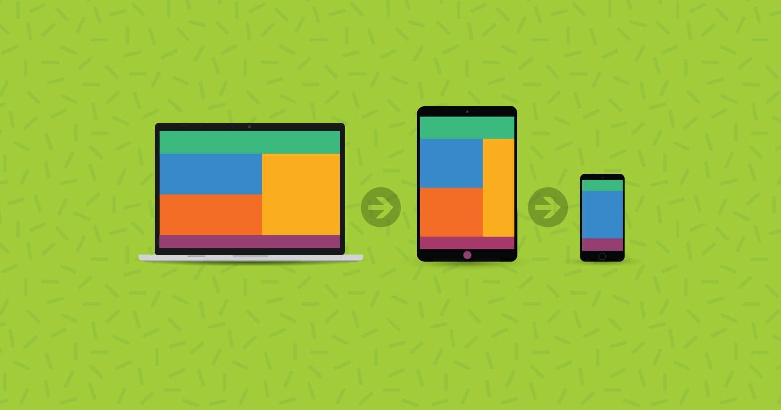
While this shift is emerging, many websites are built to target mobile users too, as well as computer users. Hence, there emerged the concept of making the website responsive, i.e, accessible on various devices of different screen ratios.
Responsive Web Design
Responsive web design refers to the idea that your website should display equally well on everything from widescreen monitors to mobile phones. It’s an approach to web design and development that eliminates the distinction between the mobile-friendly version of your website and its desktop counterpart. With responsive design, they’re the same thing.
Media Queries
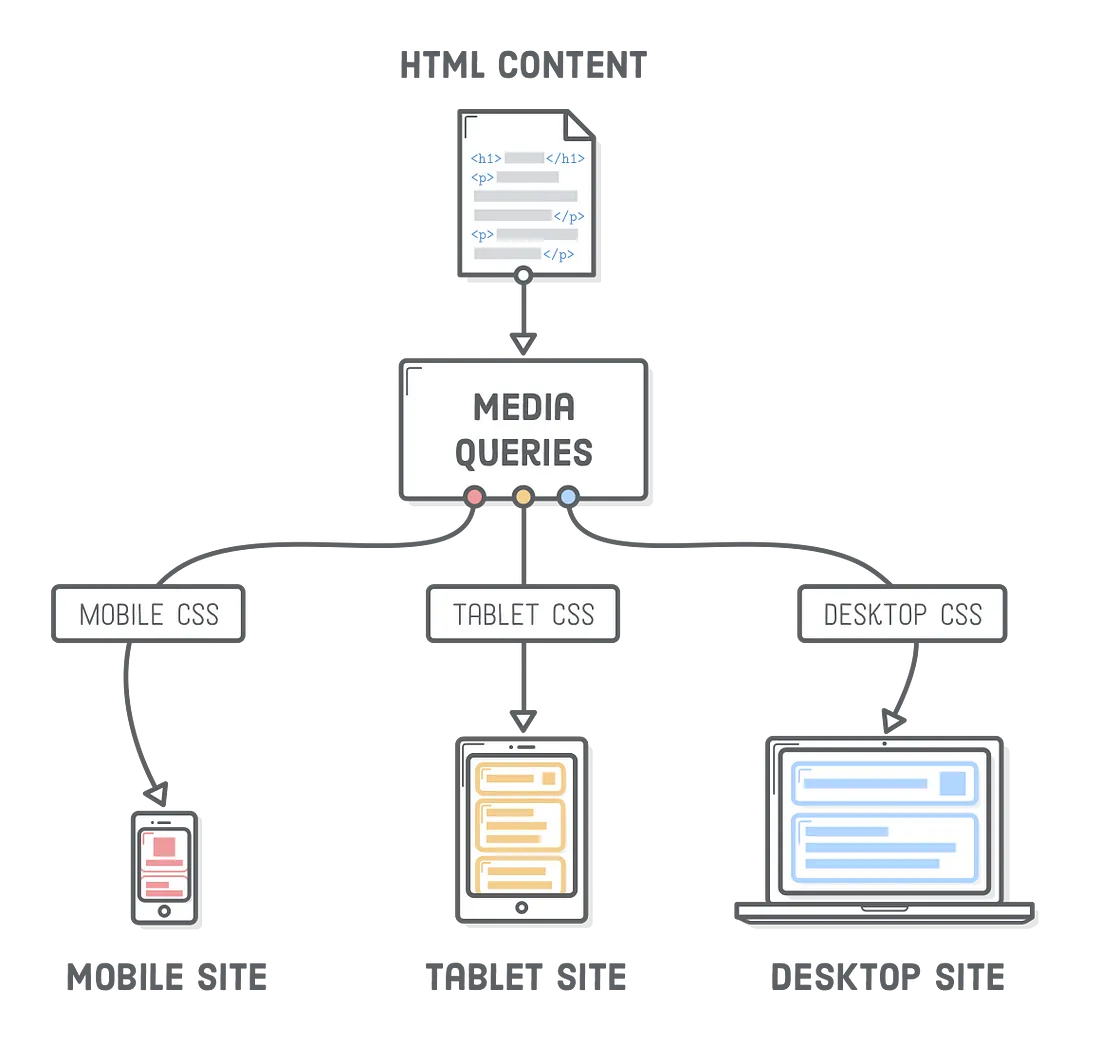
To make a website responsive we use media queries. Media queries are nothing but a way of telling the browser what CSS styles to show at a particular state. They tell the browser that it should ignore or apply certain rules depending on the user’s device.
For eg, if the website is opened on smaller devices, like mobile phones or smartphones it would show the contents of a website in a specific and different way than the same website being opened on the desktop.
Media Queries can be used to check:-
width and height of the viewport
width and height of the device
orientation (landscape/ portrait)
resolution
Viewport and Responsive Design
The viewport is the area of a webpage that is visible to the user. So, if the user is viewing your website on a smaller device like their phone, the viewport will be smaller. And if they are using desktop screens, the viewport will be larger.
There was a time when the job of a web designer was to make a website look presentable for a computer screen because phones and tablets were not in the picture, i.e. a static or fixed design.
Now, your website should be such as the user could view it comfortably on a computer, mobile, tablet, and sometimes even on a smartwatch, etc.
Because the screen size (viewport) of a mobile is considerably smaller than that of a desktop screen, the static webpages were now too large to fit on the viewport.
To fix this, browsers on those devices scaled down the entire webpage to fit the screen. But now, the text is too small to read, and the user had to zoom in and scroll through the webpage on mobiles or tablets.
And though users are used to vertical scrolling, they are not used to horizontal scrolling.
This problem is solved easily using responsive web designing.
Setting The Vieport
In HTML5, a method was introduced that would let web designers set the viewport using
<meta>tag.<meta name="viewport" content="width=device-width, initial-scale=1.0">This is the standard line that you will copy-paste into all your projects from now on. If you don’t know, the
metatag goes inside theheadand gives metadata about your HTML webpage.Here, the
width=device-widthdoes pretty much what the name suggests. It would set the width of the page to the screen width of the device.Then
initial-scale=1.0part sets the initial zoom level when the page is first loaded by the browser.
Syntax Of Media Query
Media queries are something you will use in every project if you want a responsive website or app.
A media query comprises a media type (optional) and can contain one or more expressions, which resolve to be either true or false.
Media queries are case-insensitive.
The general syntax of a media query is:
@media not|only mediatype and (expressions){
    // CSS Code here!!!
}
If the result of the @media the query is true, the corresponding CSS code inside the query will be applied, following the normal cascading rules.
The Old Way
So let us see the Old Way of writing Media Queries.
If you want to define a media query for screen sizes above a certain width you would write something like this.
@media (min-width: 1000px) {}The styles in this media query will only be applied on screen widths 1000px and above. If you wanted to do the same for small screen sizes you would do something like this.
@media (max-width: 700px) {}The styles in this media query will apply to any screen 700px or less in width. If you wanted to have a query in the middle of those values it would look like this.
@media (max-width: 700px) and (min-width: 1000px) {}The styles in this media query will apply to any screen between 700px and 1000px in width. This works perfectly fine but is overall a bit difficult to read and can lead to simple mistakes and bugs if, for example, you add some mobile-specific code into the desktop-specific media query. This is why the new range selectors are so great.
The New Way
Let's take the above media queries and convert them to the new range syntax.
/* Greater than or equal to 1000px */
@media (width >= 1000px) {}

/* Less than or equal to 700px */
@media (width <= 700px) {}

/* Between 700px and 1000px */
@media (700px <= width <= 1000px) {}
This new syntax adds less than and greater than syntax which makes writing media queries easier and more importantly makes them so much easier to read. I especially love the ability to do a range where the width is between two values. Below are all the new operators that are added with this update:
<
<=
>
>=
=The first 4 inclusions on this list make a ton of sense, but the final inclusion of equals seems a bit strange. There are almost no use cases where you would ever want to use an
=comparison since it will only work when the width of a page is exactly that pixel value.How This Solves Media Edge Cases
Take for example the following code.
@media (min-width: 500px) {}
@media (max-width: 500px) {}
The first media query will match all devices greater than 500px, the second media query will match all devices less than 500px, but what happens at exactly 500px? Both media queries will apply at 500px which could lead to weird issues or bugs with your code. This is why the new range selectors are nice since you can rewrite this as follows.
@media (width >= 500px) {}
@media (width < 500px) {}
Now at 500px, only the first media query will be used while the second will only apply to screens less than 500px.
This probably isn't a huge deal, but I guarantee if you ran into a bug that was caused by this it would be very difficult to find and a massive time sink so the fact these new range queries get around that is nice.
Trying Media Query
Open the Codepen Demo and try resizing the window to see the difference on different breakpoints.
Takeaway
Media queries can make your webpage responsive with just a few lines of code. As you learn more about media queries, you will find it easier to use them in your projects.
Media queries are used to change not just
background-colororcolorof the text, but alsofont-size, no. of rows or columns, and much more.That's it for the day see you in the next blog until then...
Keep Writing Code❤️